Before my husband and I moved to east Texas about two years ago, we lived in Austin — him for 30 years and me for 20.
About a month before we met and eventually married, I had finished the major remodel of my little cottage in north central Austin, taking it from 896 square feet to 1,618 square feet.
This is the first of several posts about my renovation project. Today you’ll see the “before” and “after” photos of my kitchen transformation.
MY KITCHEN “BEFORE”:
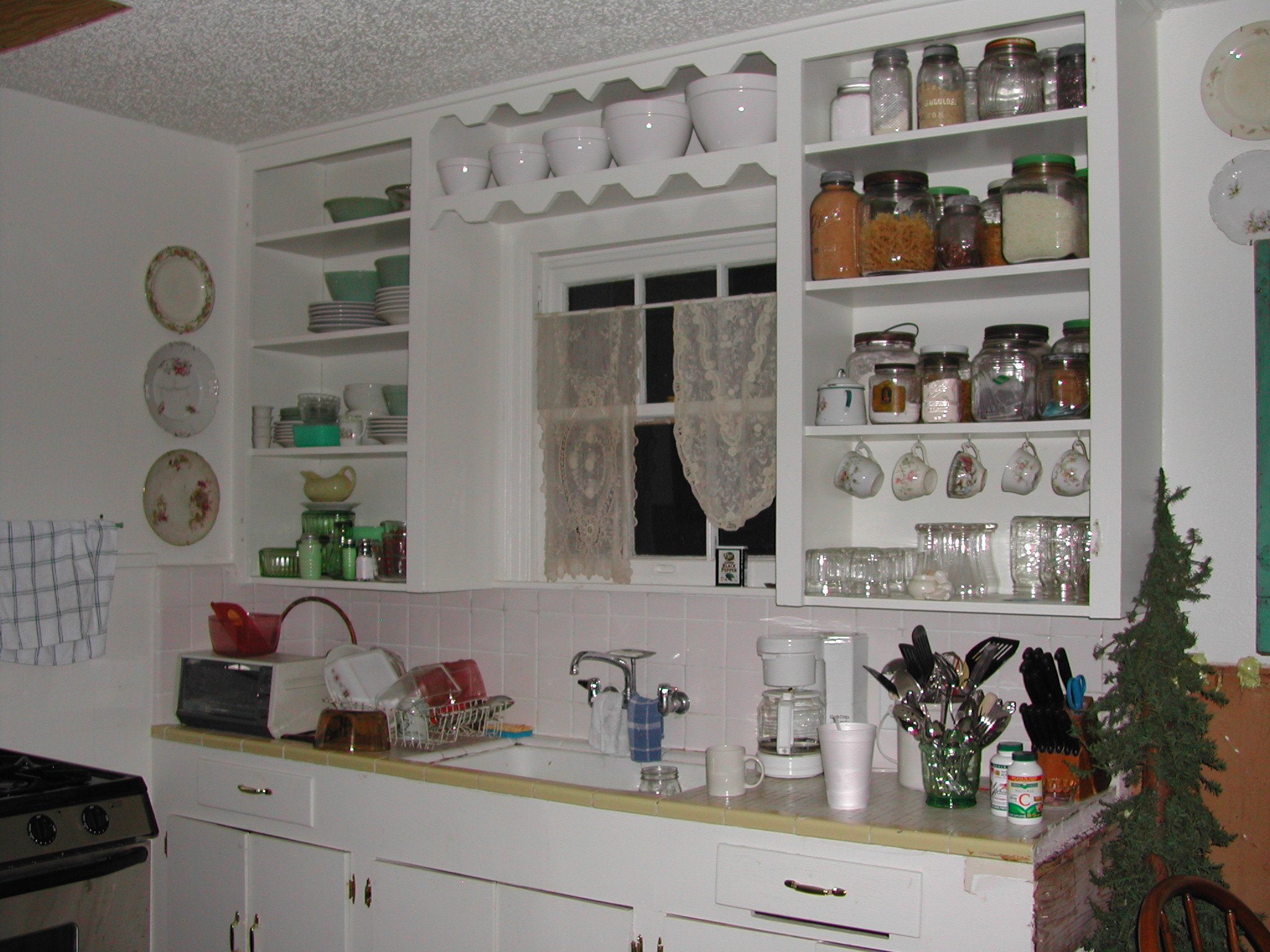
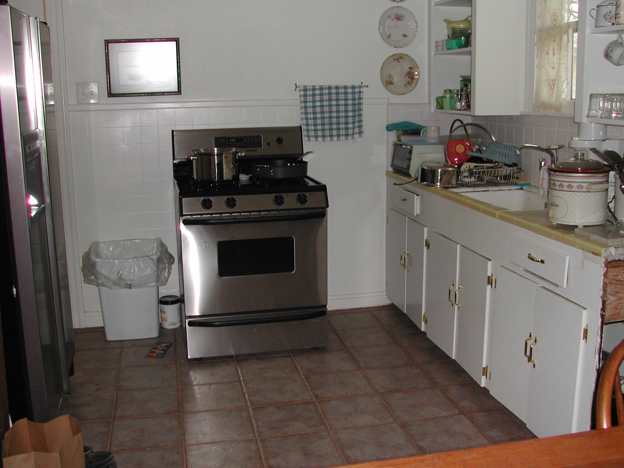
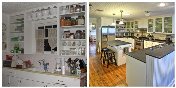
The original kitchen was very tiny and incredibly outdated. Forget about modern conveniences like a dishwasher.
Cabinetry and drawer space? You see it in this one photo. Same thing with counter space. I had about 2 feet on either side of the sink to prepare meals, make coffee, and dry dishes.
The tile countertops and floor always felt dirty no matter how much I scrubbed.
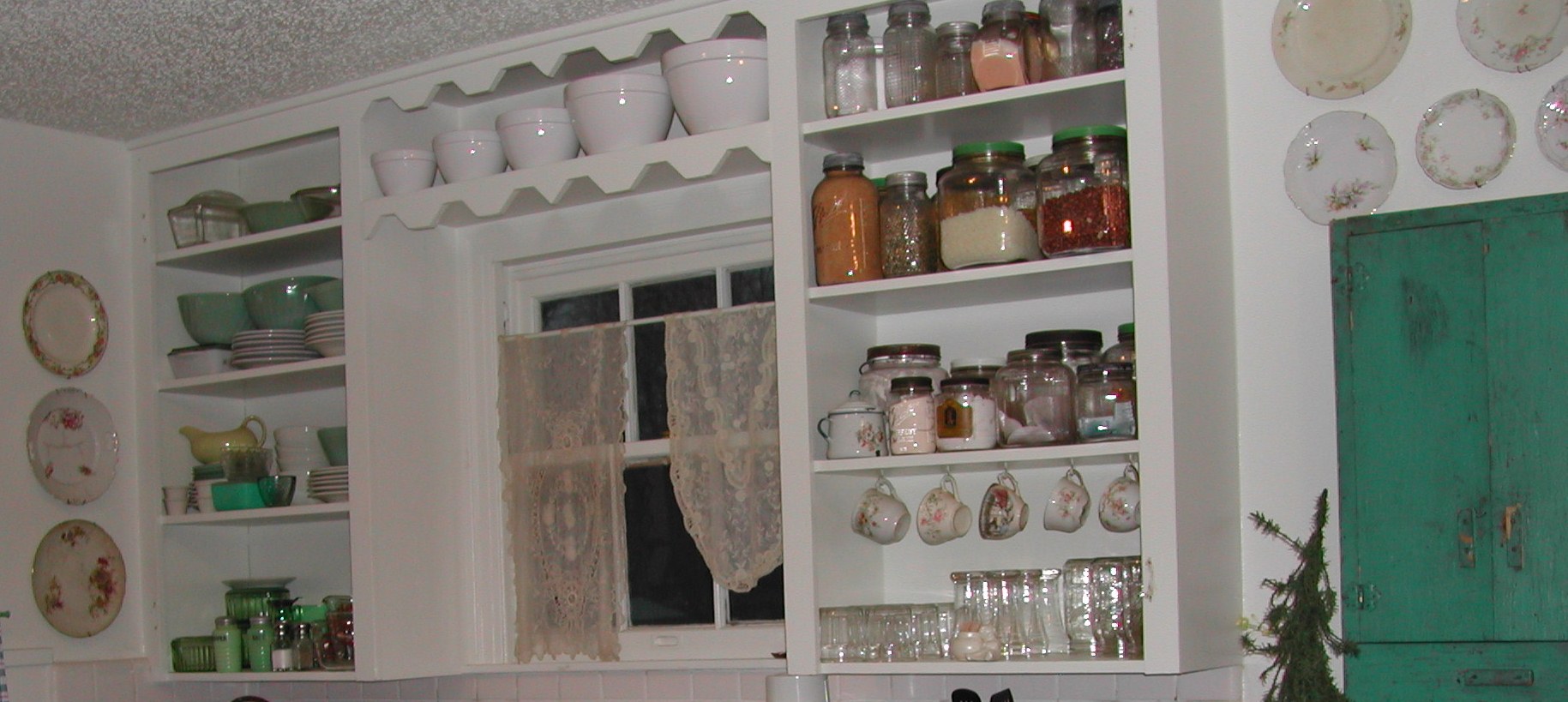
The only redeeming feature of my original kitchen was that it looked kind of cute with its open shelves. I tried to make things pretty as best I could with old glass jars, teacups, and plates.
I ate out a lot. Also, with limited prep area, I ate mostly one-dish meals.
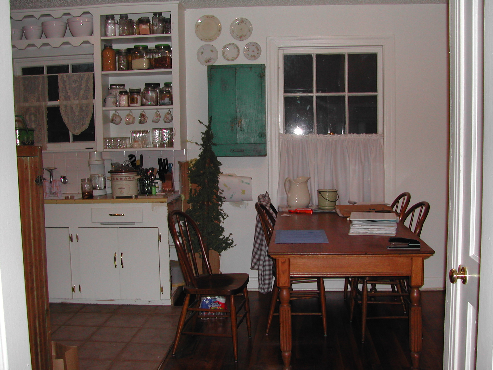
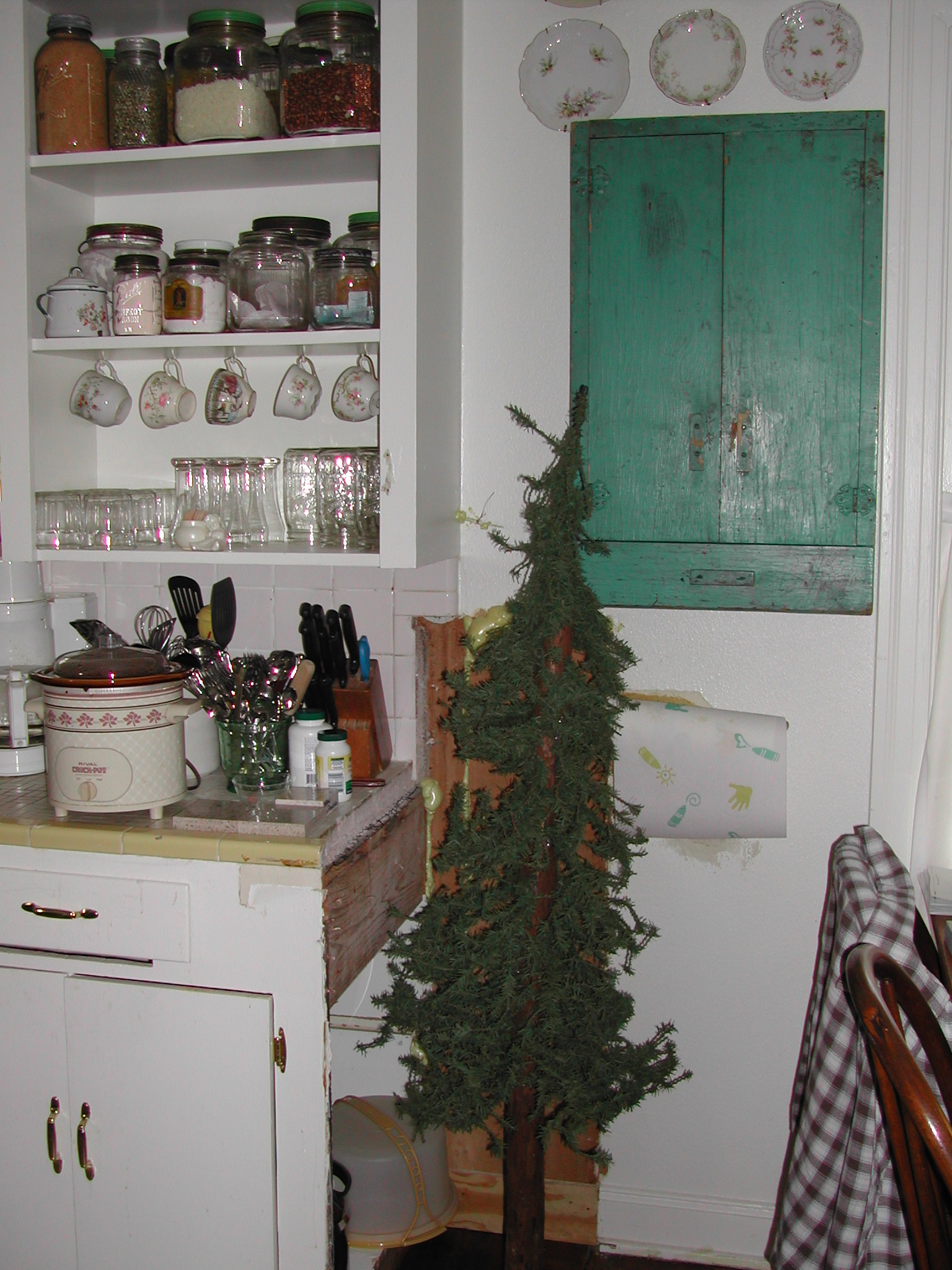
If you noticed the Charlie brown tree at the end of the cabinetry …
… it hid a really bad patch job that resulted when I ripped out a LARGE ugly peninsula. The peninsula did provide useful storage, but it also made the kitchen feel much smaller than it already was, plus I needed room for my table.
(This table also served as a desk. That large notebook you see is full of house remodeling ideas.)
Truthfully, the patch job behind the little tree didn’t bother me much. I knew the long-term plan was to renovate … so I just lived with it.
On the north wall of the kitchen was the connection for the gas range. To the left of the range was the back door.
Why the construction company ever put the back door in a corner, I’ll never know for sure. One plausible theory is that my Austin cottage, originally built in 1949, was a kit home, so they just built it according to the directions.
All I know is that it completely disrupted the flow of the entire kitchen!
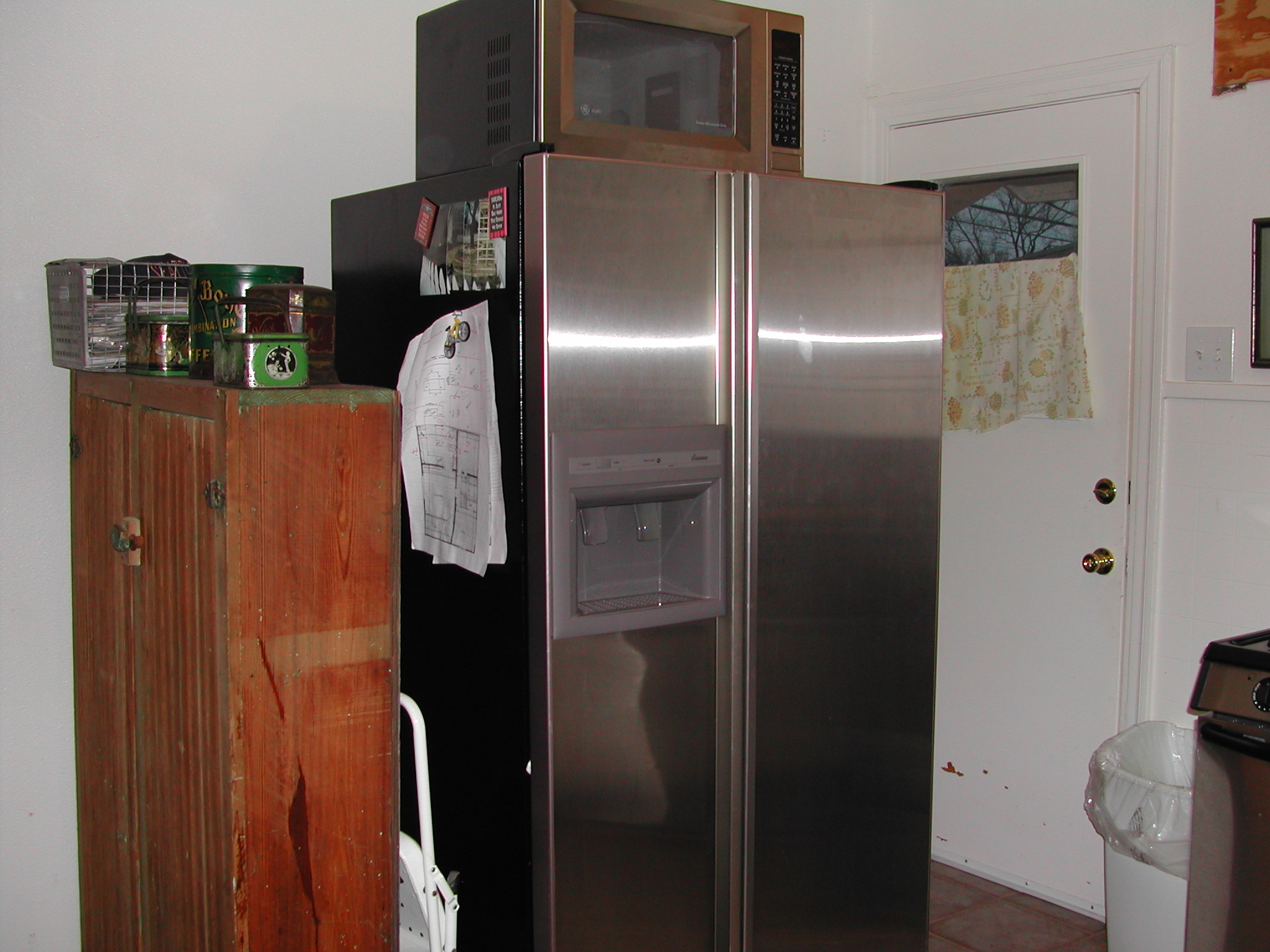
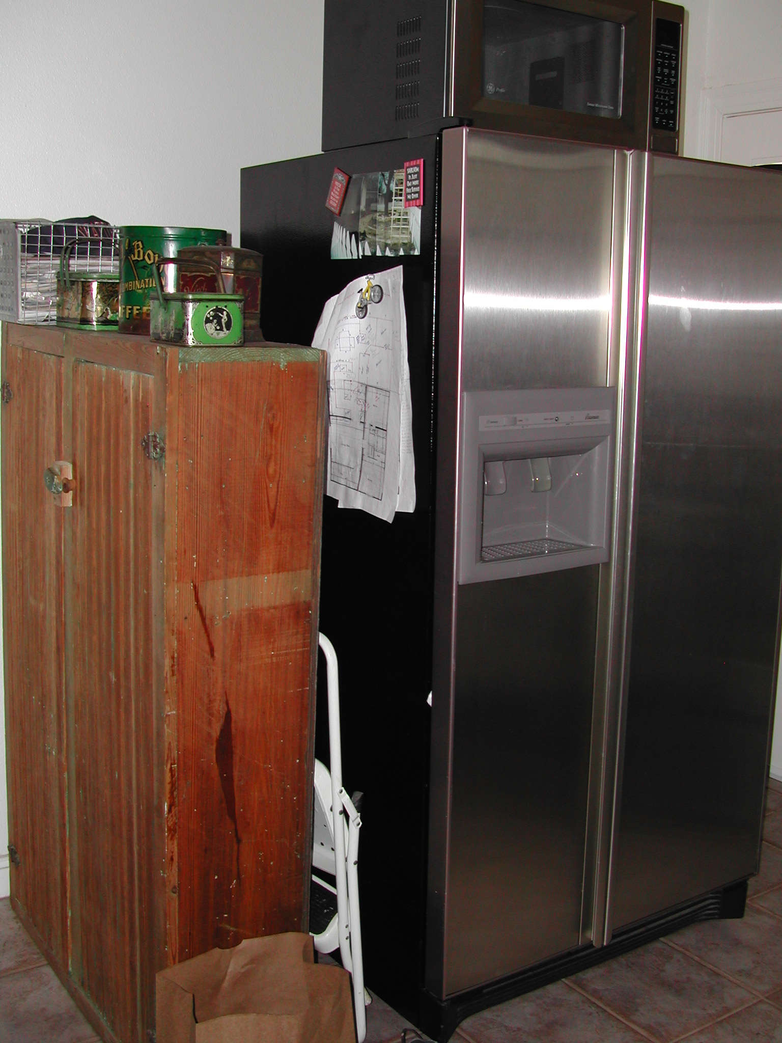
There was just enough room to squeeze by the refrigerator and range to open the back door. There was no easy fix, so I just lived with it.
There was no room for the microwave, other than on top of the refrigerator, so I used my little white stepladder often.
The pine cabinet you see? That was my pantry.
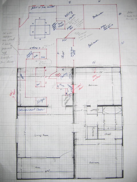
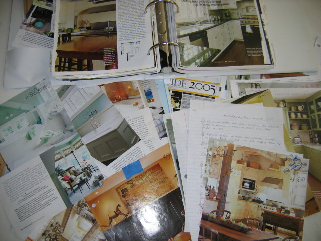
The hand-drawn papers on the side of the refrigerator were the original layout designs I drew up using graph paper …
… and ideas I’d torn out of magazines for years.
Call it “creating a vision for what the house could be”. Call me a control freak … or frugal. I just had a list of “must have this” and “would be nice to have that”, and I wanted to design in every single one of those things into the renovation.
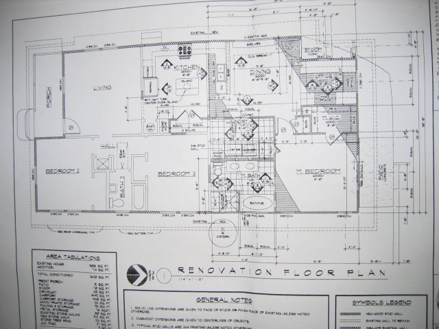
Months later, when I was ready to take the plunge, I did hire an architect to get ready for the city permitting process.
I was a single gal at the time, and it’s not like I needed more than 800 square feet. However, the horrible kitchen really did justify the huge expense and time investment of a major renovation. All of the below factors impacted my decision to renovate:
- I knew I had to move the back door to a better location.
- The tile floors and countertops had to go. They were that ugly.
- I wanted more storage for dishes, pots and pans, and food pantry items.
- I needed much more space to prep food. I couldn’t survive on Taco Bell and Hamburger Helper forever.
- I wanted modern conveniences like a dishwasher and garbage disposal.
- I wanted my microwave to be more accessible.
MY KITCHEN “AFTER”:
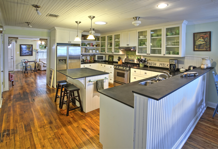
Fast forward through all the site work, framing, electrical, plumbing, drywall, (and etc.) work (which I’ll write about some other time), and this was the final kitchen.
Quite a difference, huh.
Here’s a few details that may interest you:
- I installed reclaimed oak flooring from an architectural salvage business in Austin. (Remember, this remodel was well before my husband and I started our salvage business, so I didn’t have an inventory of reclaimed wood.) After cleaning and refinishing work, the oak flooring almost exactly matched the original oak flooring.
- My carpenter installed new beadboard on the ceilings, walls, pony wall, island, and backsplash. I painted all the beadboard white. Post remodel, visitors frequently asked if it was original to the house, a testament to the enduring vintage quality of beadboard.
- Reclaimed corbels support the island overhang. Old corbels are also mounted in the doorway between the kitchen and living room. You can see a close-up of them here.
- The black countertops are not granite or soapstone but a solid surface material, by Richlite. Made from paper, it’s a sustainable product.
- The round contraption on the ceiling in the center of the room is a sun tunnel, basically a small skylight. Since there were no windows in the kitchen, the sun tunnel provided plentiful natural light.
It was definitely a labor of love, and I was so proud of what I accomplished. Let me know what you think about the transformation!
I’ll be posting more articles about my Austin home renovation in the coming weeks so stay tuned!

Stunning!
Thanks, Cher!
WOW beautiful transformation. I love this detailed chronology and your inspiration swipes. Thank God for the Internet, Pinterest and these great blogs. These are tools of empowerment for women, keep spreading your knowledge and this journey. You knocked this one out of the ballpark.
Thank you so much for the feedback! I’m trying to grow my blog as best I can, and I appreciate it very much. I am totally addicted to Pinterest because it’s so much easier than tearing ideas out of magazines and filing them away … but I’ll always keep my old idea files. I like Houzz also.
By the way, I LOVE your logo and your tagline. I totally agree that good design starts with great ideas. Too, I feel to some extent that the original architecture of a and how it sits on the land will tell you how it can be updated. Meaning, for my 1949 cottage, I wanted to keep maintain the vintage character. I didn’t want the addition to scream “I’m new” and have the old part of the house say the opposite.
Beautiful! I am renovating an old house also, so I can appreciate all the work you put in to make that a beautiful kitchen.
Oh, wow! I’d love to see “before” and “after” photos!
Ricky Hanson says, wow, looks great, like a whole new place.
Thank you, Ricky! I was sure proud of it.
WHOA!! just whoa!
Whoa! is good. I’ll take that. 🙂 Thanks!
Your kitchen looks great! Transformation is incredible!
One question, when the backsplash and countertop was removed, did you have some sort of thin metal underneath? I’m also remodeling my old kitchen.
Thanks so much! W didn’t find any thin metal underneath the backsplash and countertop. The kitchen finishes we replaced were not original, though. I think the kitchen was probably redone in the 80’s.
I kid you not, the 5th picture from the top with your stove is the mirror image of my kitchen. My house was built in 1948 in Central Florida and also has a doorway in the back corner behind my fridge. Thankfully, my kitchen is longer and wider so I don’t have any space issues with it (even my window is in the same location, but is about triple the width), but I find it funny that it’s the exact same setup! In fact, the right picture in your magazine binder looks like my kitchen (minus all the nice new stuff and some of the cabinets)! Instead of a peninsula, I think there used to be a wall in my house. But at some point it was removed and a very thin bar was put in, which I will rip out soon. Now, in our case, the stove is floated out like that because in the cabinets next to it is our hot water heater for our entire house. One day soon it will be moved. I just had to stop and comment when I saw it. Crazy.
What a coincidence! Did you see my post on that? LOL!